
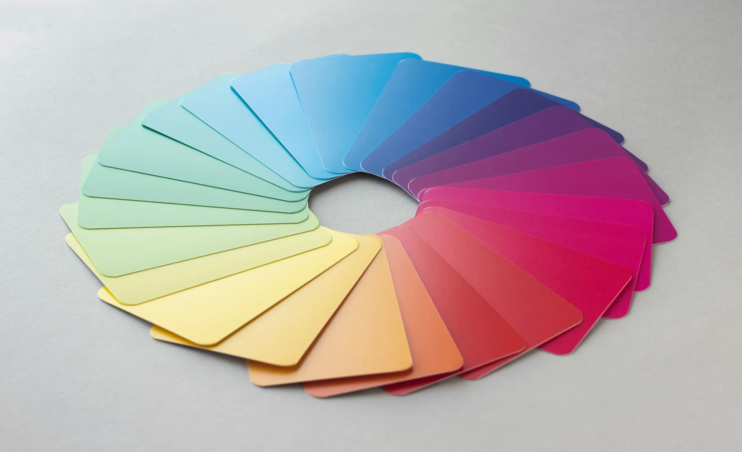
People form an impression of a business in seconds, and most of that impression comes from how it looks: the logo, the colours, the type, the consistency between a website, a social post and a printed brochure. None of that is decoration. It is the visual half of how a business communicates.
Good design is also a practical discipline with concrete requirements — file formats, contrast ratios, print specifications, licences — that are easy to get wrong and expensive to fix later. This guide covers the difference between a logo, an identity and a brand, what a logo actually has to do, how to choose colour and type sensibly, how to prepare work for screen and print, and when a rebrand makes sense.
Logo, identity and brand: what is what
These three words are used interchangeably, and the confusion leads to badly scoped projects. They are related but distinct.
| Term | What it is | Who controls it |
|---|---|---|
| Logo | The mark or wordmark that identifies the business | You and your designer |
| Visual identity | The system around the logo: colours, typography, imagery style, layouts, icons and patterns | You and your designer |
| Brand | What customers believe and expect from the business, formed by every interaction with it | Your customers, influenced by everything you do |
A designer can create a logo and an identity. Nobody can design a brand directly, because a brand is a reputation. What good design does is make the business look consistent and credible, which supports the reputation the service and the people behind it have to earn.
This matters when scoping. A request for “a logo” and a request for “a brand identity” are different projects with different deliverables and different costs.
What a working logo needs
A logo is a tool, and it is judged by where it has to work. It will be shrunk to a browser tab and enlarged onto a shopfront, reversed onto dark backgrounds, printed in one colour on a receipt and embroidered on a shirt. A logo that only looks good large, in full colour, on white, has not finished its job.
Qualities that hold up
- Simple enough to recognise quickly and to reproduce without loss of detail.
- Legible at small sizes — check it at favicon and social profile-picture size.
- Works in a single colour, and in black and white.
- Distinctive within its own market, not just generically attractive.
- Appropriate to the audience, rather than following whatever is fashionable this year.
- Balanced in more than one arrangement, such as horizontal, stacked and icon-only.
The files a logo should come with
The single most common practical failure is being handed one small image. A professionally delivered logo comes as a set:
| Format | Type | Used for |
|---|---|---|
| SVG | Vector | Websites and apps — scales to any size without quality loss |
| PDF or EPS | Vector | Print, signage, and handing to a printer or supplier |
| PNG | Raster, with transparency | Everyday use in documents, presentations and social media |
| Editable source | Design file | Future adjustments by a designer |
Vector files describe shapes mathematically, so they stay sharp at any size. Raster files (PNG, JPEG) are made of pixels and blur when enlarged. A logo that exists only as a raster image will eventually need to be redrawn, which is why the vector master is the deliverable that matters most.
Ask for variations too: full colour, single colour, white-on-dark, and an icon-only version for small spaces. They should be delivered as part of the project, not as later requests.
Colour: what holds up and what doesn’t
Colour choices are often justified with confident claims that particular colours cause particular feelings or purchases. The research does not support that kind of certainty. Responses to colour vary with culture, context, product category and personal experience, and much of the popular material is repeated without a rigorous source. It is safer to treat colour associations as tendencies, not rules.
More dependable considerations are practical:
- Differentiation: in a market where every competitor uses the same blue, a different palette may be more useful than a theoretically ideal one.
- Contrast: the colours must work together for legible text (see below).
- Range: a palette needs a primary colour, neutrals and a small number of accents, not five equally loud colours.
- Reproduction: colours look different on screens, on paper and on other materials, so specify them for each use.
- Consistency: fixed values recorded in the guidelines, so the brand does not drift.
Colour values need to be specified in more than one system. Screens use RGB, usually written as a hex code; print commonly uses CMYK, and sometimes spot colours matched to a physical swatch. A colour that looks vivid on screen may be duller in CMYK, so review a printed proof before approving a large print run.
Typography and font licensing
Typography carries much of a brand’s personality and nearly all of its readability. A workable system is modest: one typeface for headings, one for body text (sometimes the same family), and clear rules for size, weight and spacing.
Fonts are also licensed software, and this catches many businesses out. A licence for desktop use typically does not cover embedding the font on a website or in a mobile app, and different uses may need separate licences. Typefaces released under open licences, such as those published under the SIL Open Font License, can be used commercially with few restrictions, which is why they are a sensible default for many small businesses. Always check the licence for the exact use before committing a brand to a font.
Accessibility and contrast
Design decisions have a direct effect on whether people can read your content. The W3C’s accessibility guidelines set a minimum contrast ratio for text at conformance level AA: 4.5:1 for normal text and 3:1 for large text. Pale grey text on white and light text over busy photos are the usual offenders.
Building this into the palette from the start is easier than fixing it later. Test the main text and background combinations, check that colour is never the only way information is conveyed, and confirm that the logo remains legible on both light and dark backgrounds.
Brand guidelines
Guidelines are what turn a set of files into a system that other people can use correctly. They do not have to be a hundred-page document. For a small business, a concise guide covering the following is enough:
- The logo, its variations and minimum size.
- Clear space around the logo, and examples of incorrect use (stretching, recolouring, adding effects).
- The colour palette with hex, RGB and CMYK values.
- Typefaces, sizes and hierarchy for headings, body text and captions.
- Imagery and illustration style, if these are part of the identity.
- Layout principles and a few example applications.
- Tone of voice, where it is part of the brief.
Social media design
Social design differs from print in one important way: the frame is controlled by someone else. Each platform crops, overlays and resizes content in its own way, and dimensions and safe areas change from time to time. Verify the current specifications in the platform’s own help pages rather than trusting an old article.
- Design templates, not one-off posts, so a feed looks like it comes from one business.
- Keep text and logos inside safe areas away from the edges, where interface elements and cropping intrude.
- Prepare profile images that still read when displayed very small, often in a circle.
- Use one clear message per graphic; a feed is scrolled at speed.
- Keep text large enough to read on a phone, and check contrast against the background.
- Export in the sizes each platform asks for, and keep editable files so text can be updated.
- Include alt text when posting where the platform supports it, so images are accessible.
Banners and ad creatives
Advertising graphics have a narrower job than brand design: to be understood quickly and prompt one action. The same brand rules apply, but the priorities shift.
- One idea and one call to action per creative.
- A clear visual hierarchy: what the eye reads first, second and third.
- Sizes prepared for each placement the platform supports, since the same layout rarely works everywhere.
- Variants for testing — a different headline or image, changing one thing at a time so results can be understood.
- Compliance with each platform’s advertising policies, which restrict some claims and amounts of text.
- Consistency with the landing page the ad leads to, so the visitor recognises where they have arrived.
Performance is measured, not assumed. A visually striking ad that does not produce enquiries is a weaker ad than a plain one that does, so creative should be reviewed against the campaign’s results rather than personal taste.
Print-ready design
Print exposes mistakes that never show on a screen. A design that looks perfect in a browser can arrive at the printer with blurry images, cut-off text or wrong colours. The requirements below are general; printers differ, so ask for the specification of your printer before finalising files.
| Requirement | What it means |
|---|---|
| Bleed | Artwork extends beyond the trim edge so no white slivers appear after cutting. A few millimetres is common, but the printer sets the exact figure. |
| Safe area | Important text and logos sit inside the trim line so they are not cut off. |
| Resolution | Images generally need to be much higher resolution than for screens — around 300 pixels per inch at final size is a common target. |
| Colour mode | Commercial print usually works in CMYK, with spot colours where a precise match is needed. |
| Fonts | Embedded or converted to outlines, so the printer does not substitute a different font. |
| File format | Usually a press-ready PDF, exported to the printer's settings. |
Where colour accuracy matters, request a proof. Paper stock and finishing (matt, gloss, uncoated) also change how a design looks, so choosing them belongs in the design conversation, not after it.
Packaging and product design
Packaging combines graphic design with physical constraints. Artwork is laid out on a dieline — the flat template of the box, pouch or label, showing folds, cuts and glue areas — and it has to work when folded and viewed from several sides.
- Get the dieline from the manufacturer or printer first; do not design against a guessed template.
- Check regulatory content early. Food, cosmetics, supplements and other categories often require particular information on the label, and the requirements depend on the country of sale.
- Plan for barcodes, batch codes and legal text, which need space and minimum sizes.
- Consider material and finish, since colour and detail behave differently on card, plastic, metal and paper.
- Keep the design consistent with the wider identity, so products and marketing look related.
- Request a physical proof or sample before a full production run.
Rebranding: refresh or replace?
Rebranding covers a range, and it is worth being clear about where on the range you actually need to be.
| Approach | What changes | Suits |
|---|---|---|
| Refresh | Logo refined, colours and type updated; the recognisable core stays | A sound identity that looks dated or is inconsistently applied |
| Evolution | A more substantial redesign that keeps a link to the old identity | A business that has grown or moved upmarket |
| Full rebrand | New name, identity and often positioning | A change of ownership, a merger, a new market or a damaged reputation |
Good reasons to rebrand include:
- The business has changed and the identity no longer describes what it does.
- The current design cannot be used properly across digital channels.
- Different materials look like they come from different businesses.
- A merger, acquisition or move into a new market.
- The identity is confusingly close to another business.
Poor reasons include boredom and following a trend. A rebrand has real costs: replacing signage, stationery, packaging, profiles and web assets, and losing some of the recognition already built. Plan the rollout — what changes first, and how customers are told — before the design is finished, and check that domain names, social handles and legal documents are updated together.
Ownership, trademarks and AI tools
Three legal points are worth understanding before any project starts. This is general information, not legal advice; for anything significant, consult a qualified professional.
Who owns the design
Ownership of commissioned design depends on the agreement and on local law, and it should be written down. Confirm what you receive, whether it is a transfer of rights or a licence, and what happens to the source files and any unused concepts.
Trademarks
A logo can normally be protected as a trademark, but only if it is distinctive and does not conflict with existing marks. Design does not check this. Search the trademark register in your market before committing to a name or logo, and consider registering it once you are confident in the design.
AI-generated imagery
Generative AI tools are useful for exploration and mood boards. Using their output as a final logo is riskier. The U.S. Copyright Office has published guidance on copyright and artificial intelligence concluding that human authorship is required for copyright protection, and that content generated purely from prompts is not protected in the way human-authored work is. Rules vary by country and are still developing, but the practical implication is consistent: a logo you cannot claim exclusive rights in is a weak foundation for a brand.
Briefing a designer well
The quality of the result is heavily influenced by the quality of the brief. A useful brief is short and specific:
- What the business does, who it serves and what makes it different.
- Who the design is for, and where it will be used (screen, print, signage, packaging).
- Examples you like and dislike, with the reason for each.
- Any constraints: existing colours, mandatory text, budget, deadline, printer.
- The deliverables you expect, including file formats and variations.
- How decisions are made and who approves the work.
- How many concepts and revision rounds are included.
Feedback is part of the process. Comments such as “make it pop” are hard to act on; comments that explain the problem — the text is difficult to read, this looks too formal for our customers — let the designer solve it properly.
Mistakes worth avoiding
- Accepting a logo delivered only as a small raster image.
- Choosing colours that look good but fail contrast checks for text.
- Using a font without checking that its licence covers the intended use.
- Designing a logo that only works in full colour on white.
- Skipping brand guidelines, so every new item looks slightly different.
- Sending screen-resolution images to print, or omitting bleed.
- Approving a large print run without a proof.
- Using near-identical designs to a competitor, or not checking trademarks.
- Rebranding to follow a trend rather than to solve a problem.
- Leaving ownership and revision terms unstated until a dispute.
Frequently asked questions
A logo is a single mark or wordmark. A brand identity is the wider visual system built around it — colours, typography, imagery, layouts and rules for using them. The brand itself is what customers believe about your business, which design supports but cannot create by itself.
Final thoughts
The design decisions that matter most are rarely the dramatic ones. They are practical: a logo that works at every size and comes with the right files, colours that pass a contrast check, fonts you are licensed to use, templates a team can reuse, and print files that arrive at the printer in the form it needs.
Get those right and a business looks consistent and credible without constant effort. Get them wrong and the cost shows up later — as redrawn logos, reprinted brochures and materials that never quite look as if they belong together.
Start with a clear brief, ask for the complete set of files and guidelines, agree ownership in writing, and treat the identity as a system to be maintained rather than a one-off deliverable.